STUFF I’ve MADE
Bench ✦ Brand Design System

Bench • Brand Guidelines • Design Systems • Figma (2022)
Bench Accounting is America’s No. 1 professional bookkeeping services and tax advisory fintech platform with over 12,000 U.S.-based customers supported by 650 employees.
The task → Refresh the company’s brand guidelines, transition the brand design team to Figma, and create libraries based on the new guidelines to establish consistency and scalability.
The challenge → In terms of the brand guidelines, they were not aligned with the current design of the product and lacked adequate guidance, which had lead to inconsistencies and lack of brand cohesiveness. The goal was to create a new set of guidelines that could be used as a foundation for both product and brand, and address any accessibility issues. The brand design team had also been previously working exclusively with Sketch and Adobe Creative Suite. In addition to updating the brand guidelines, I was also responsible for migrating the team to Figma by creating a brand design system, libraries and templates from scratch to unify and expedite our internal processes.
My role→
Conducting an audit on the current brand guideline and product design system and noting inconsistencies and areas of improvement
Running workshops with the brand design team and product design teams to collaborate on the vision and design direction for the brand
Replacing a key colour within the brand, as it was creating several accessibility issues for elements like buttons
Developing a new, tiered colour palette system
Partnering with an external vendor to create a custom illustration library
Defining the image style of the brand and how image styles are paired together
Collaborating with the product design team on a new icon set to be used across the app and brand efforts
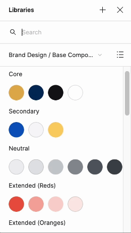
Leading the project to develop a brand design system in Figma, which included—colours, type stack, grid system, core brand elements (buttons, labels, hyperlinks), imagery, illustrations, and icons
Provide training for the team on how to use the Figma platform and the new libraries
Writing the brand guidelines, which included an overview and guidance for the following sections—the Bench brand, logos, colours, typography, grids and layout, imagery, illustrations and iconography
The impact → The guidelines and Figma libraries lead to a much higher brand consistency in design assets. The processes for designing, collaboration, feedback and approval in Figma provided clarity for the team—our output as a brand design team doubled within a year of switching to Figma. The team felt more confident and empowered with these design tools and processes in their hands.
Creative Standards
Establishing core standards at the outset allowed us to identify what was important to us as a design team and set a solid foundation for the rest of our design practice.
clear
Running a business can be complicated. Our visual identity is not. We strive to build an experience that values clarity above all else.
consistent
Consistency is our biggest asset in developing trust. Every touchpoint carries the same visual DNA, from the top of the funnel to the Bench app.
Inclusive
Bench is actively engaged in inclusivity throughout our workplace, and visual identity is no exception. Accessibility is a priority in all designs.
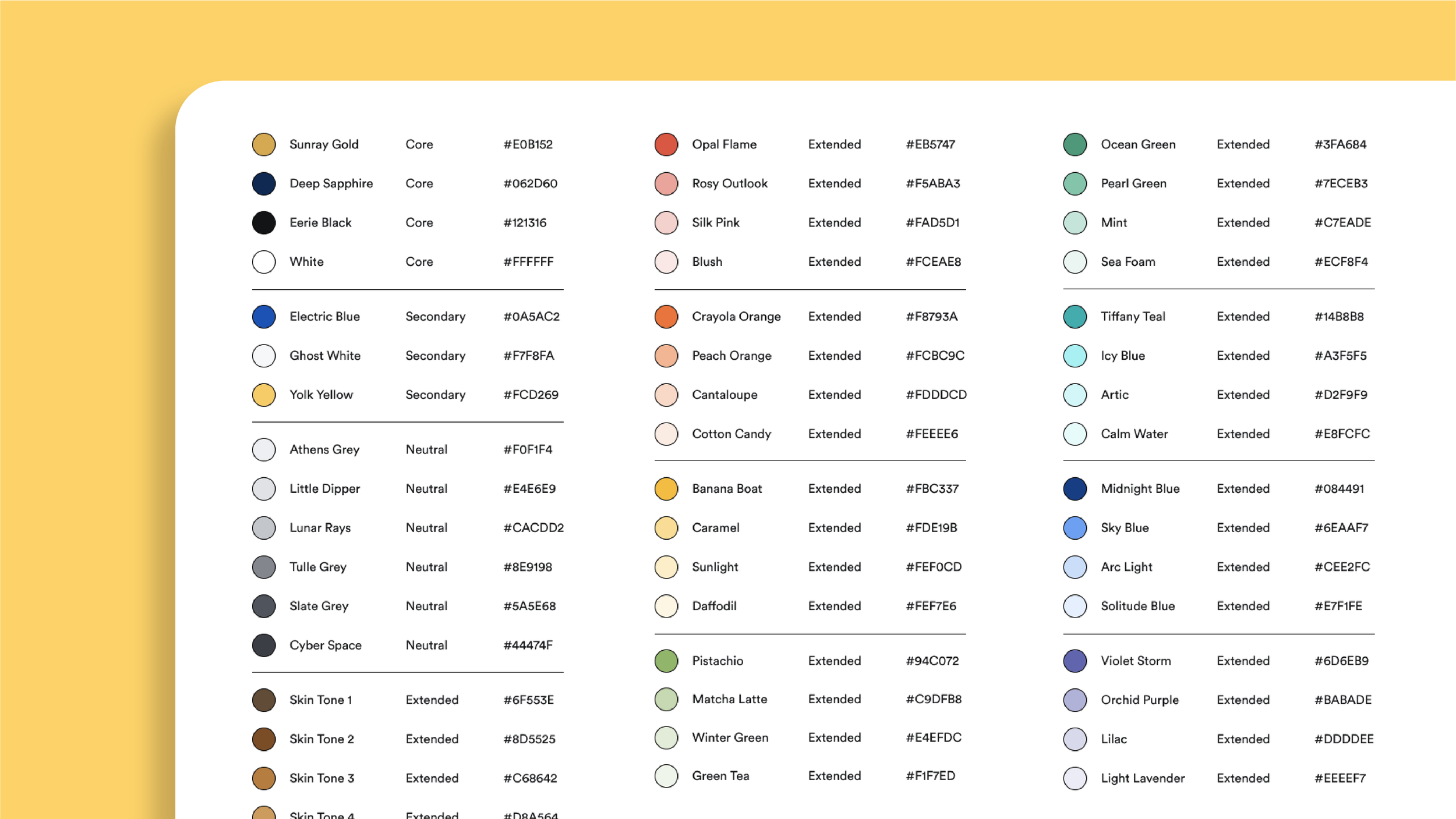
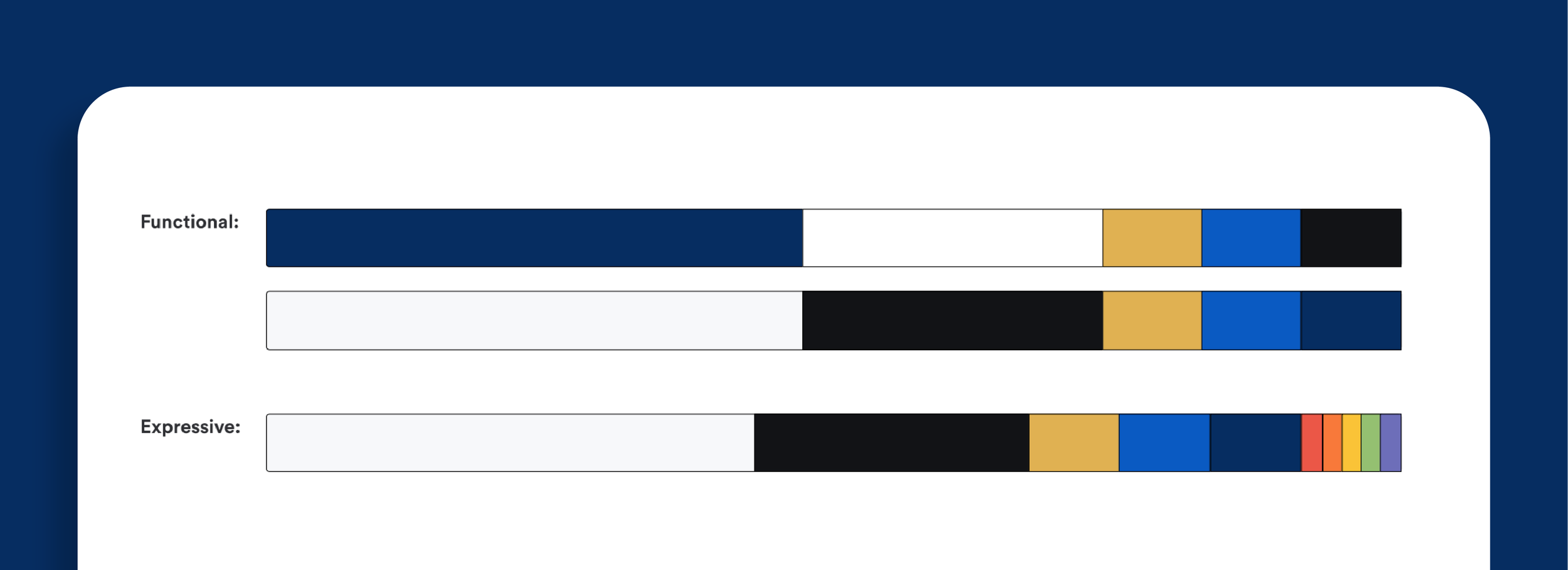
coloUr
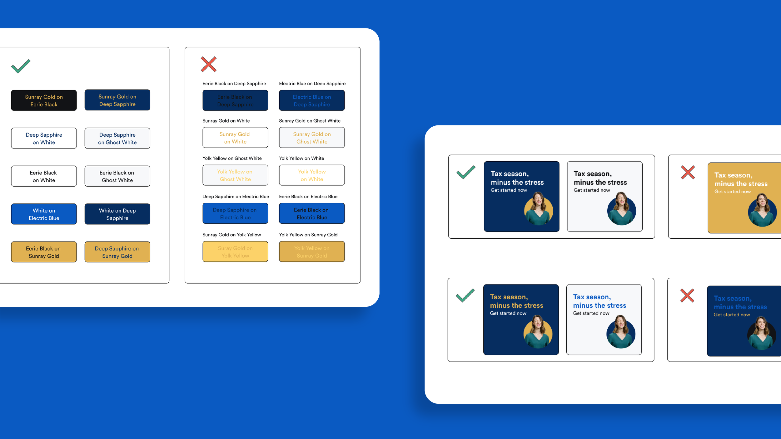
The previous guidelines did not have a clear hierarchy or usage guidelines for the brand colours. In the new guidelines, we established three tiers of colour palettes—core colours, secondary colours and extended colours (which included a netural colour palette and a skin tone colour palette). As inclusivity is one of our creative standards, it was vital that all text colour combinations needed to meet AA accessibility standards. We implemented tools such as WebAim and the Contrast Figma plugin to ensure we were meeting contrast standards for every design asset that was created.
During the audit, we discovered that the teal colour that was being used as the primary button colour across the website did not meet WCAG AA standards. After several rounds of approval, the biggest change we made with the new guidelines was replacing the teal colour with an electric blue.

typography
Creating a clearly defined typestack was key during this brand refresh. In the previous guideline, only the typefaces were specified—which caused varying text sizes across design assets. In the new guideline, we outlined a clear hierarchy with defined point sizes, weights, leading, and tracking for headers, body text, quotes, buttons, labels, attributions, hyperlinks and any other text element. In addition, we specified instructions for how to pair different text elements together with examples of “do’s” and “dont’s”.


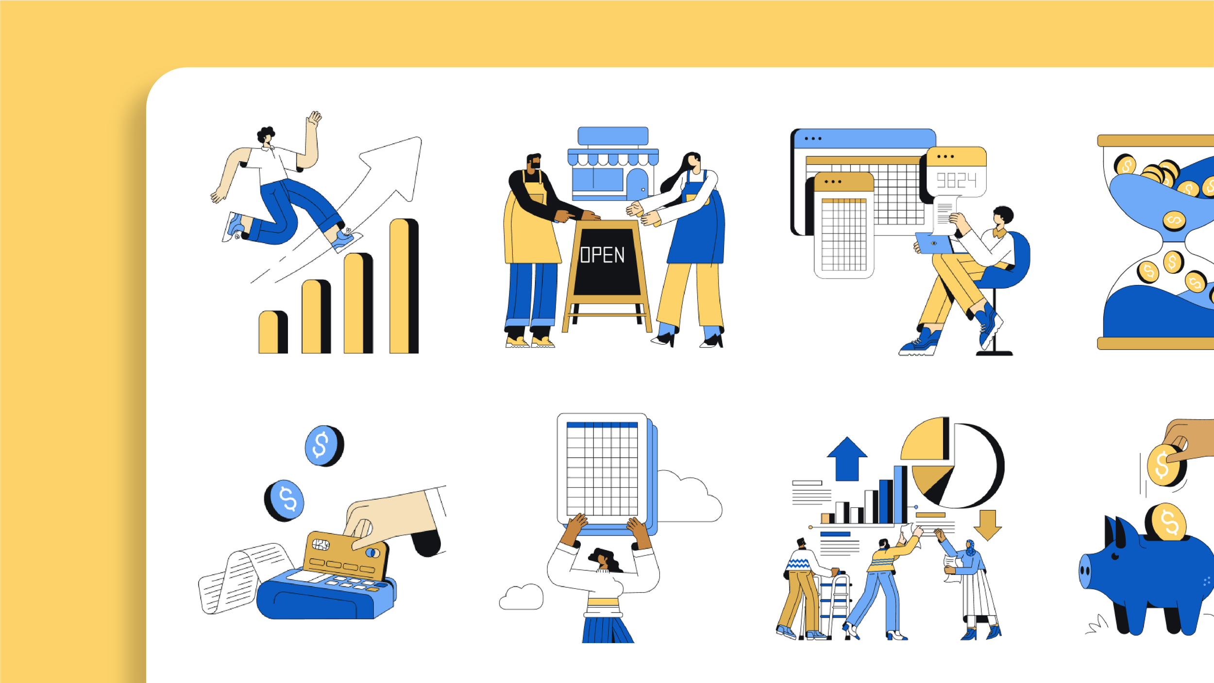
illustrations
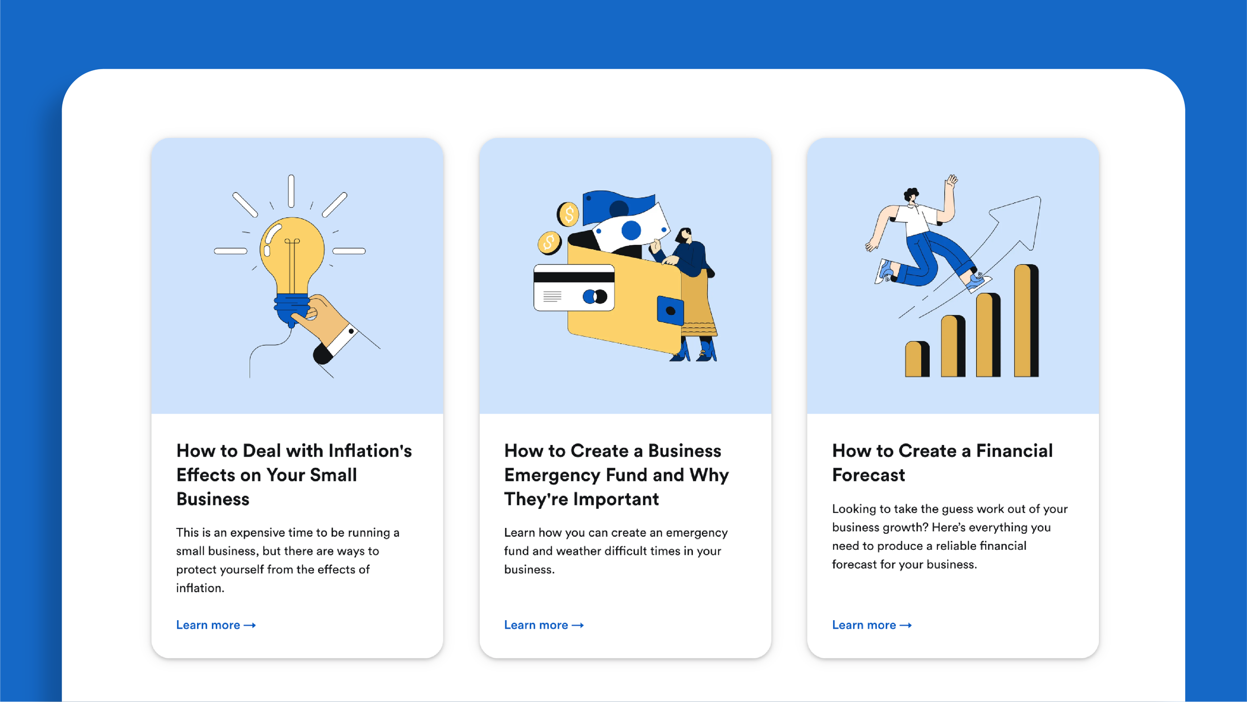
During the audit, we noticed that there were several different illustration styles across the website, blog and social media. We partnered with an illustration company to create custom illustrations that fit the themes of finance, taxes and small business to meet the brand’s needs. The illustration style is bold, yet minimal— featuring clean lines that pair perfectly with our brand iconography style. The illustrations communicate meaningful messages that add value while keeping the design minimal.
The illustrations are mainly used on the Bench blog, once we had the new style defined—we updated the illustrations across the website and blog. We created the illustrations in our core colour palette, but also made several variants using our extended colour combo to allow for more flexible use. We built out a robust illustration library within Figma, which allowed the team to go in and pick illustrations and make changes more efficiently.


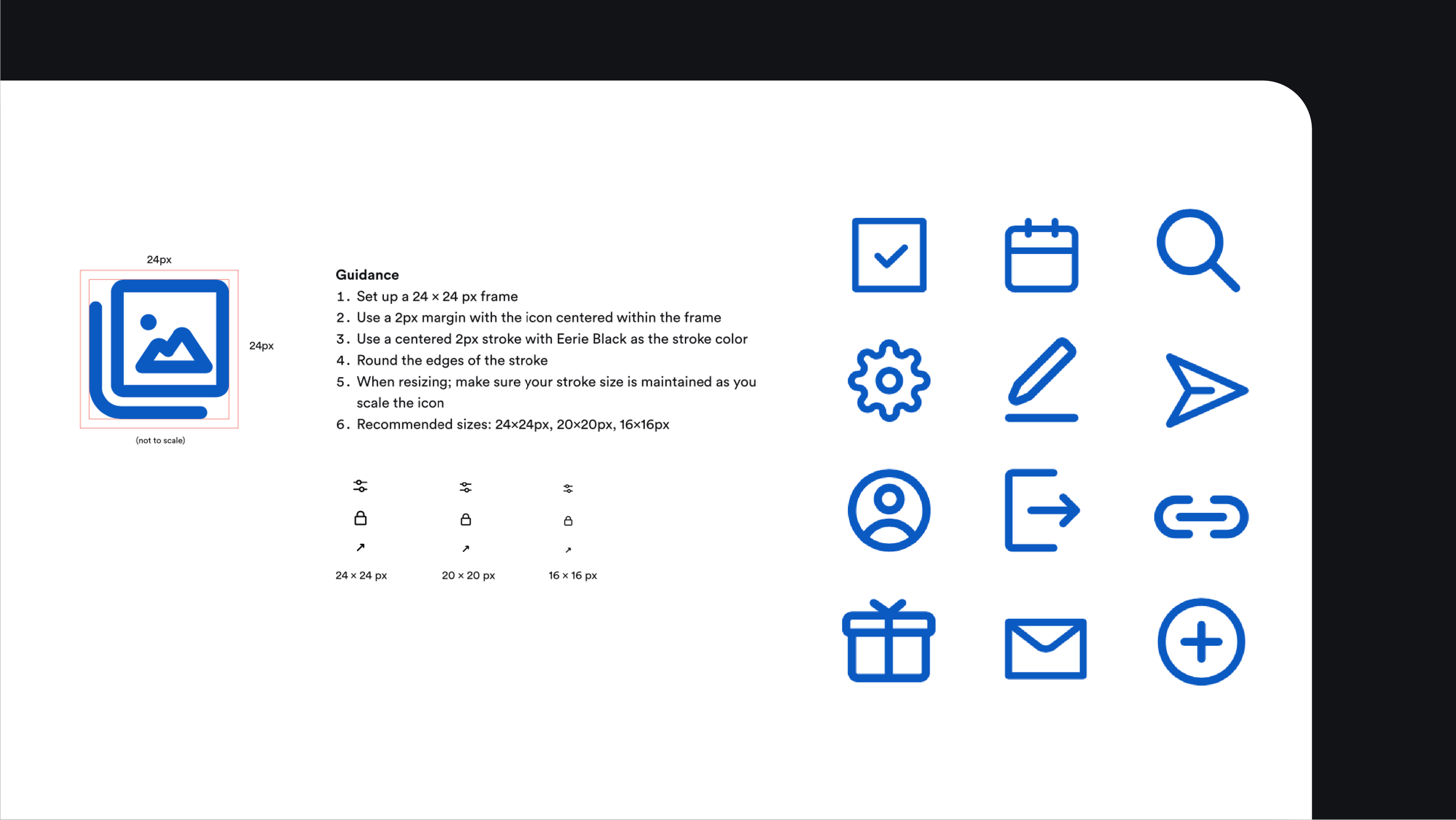
iconography
We collaborated with the Product Design team to develop an icon library that could be used across the Bench platform, website and branding efforts. The iconography is minimal and clear—with clear instructions how to create a new icon from scratch if needed.

imagery
The new guidelines outlined three main image categories close to the heart of Bench’s brand: the people, the clients and the product.
People: Photography that reflects the Bench brand.
Lifestyle: Various in-situ imagery reflecting common themes around our business, including small business owners and nance. The focal point of all imagery is the people.
Product: Shown as either in its fully functional form or in an abstract form for simplicity for certain assets. Devices used are brand-agnostic and minimal to put the spotlight on the product itself.
To reflect how the Bench product is combination of technology and people support; we often use pairings of people and the software. We primarily select photography that include pops of the brand’s core palette—blue and yellow. The themes of the images center around small business owners, finance and working environments. The images should be light, with no harsh shadows and the expressions should be natural, and not too posed. We also ensured the imagery reflected the diversity of the client base, audience and Bench community To highlight the product, simplified graphics of the Bench app interface are used. This allows for a clean and clear way to display our product, and not have users overloaded by information.


Credits:
Brand Design Team: Arshika Chandranath, Jessica Nguyen, Noemi Cisneros